Role: Lead Product Designer, Three
Redesigning a business-critical onboarding journey

+52%
£109k
Three is one of the UK's largest mobile network providers. Its app is the primary self-service channel for millions of customers, enabling them to manage accounts, track usage, pay bills and access support.
Challenge
During COVID-19, digital became the primary way customers interacted with Three. However, only 19% of customers successfully completed registration on their first attempt, creating a significant opportunity to improve self-service adoption, reduce customer frustration and lower support costs.
I led the redesign of the onboarding experience, simplifying registration and removing the barriers preventing customers from successfully accessing their accounts.


Outcomes
Business Impact
50,000 fewer customer complaints per month
£109k monthly operational savings
Reduced dependency on support teams during store closures
Customer Impact
Registration success increased from 19% to 71% (+270%)
Email validation success increased from 35% to 69%
Forgot-password interactions reduced by almost 50%
NPS increased by 14 points

The design solution
Research & Discovery
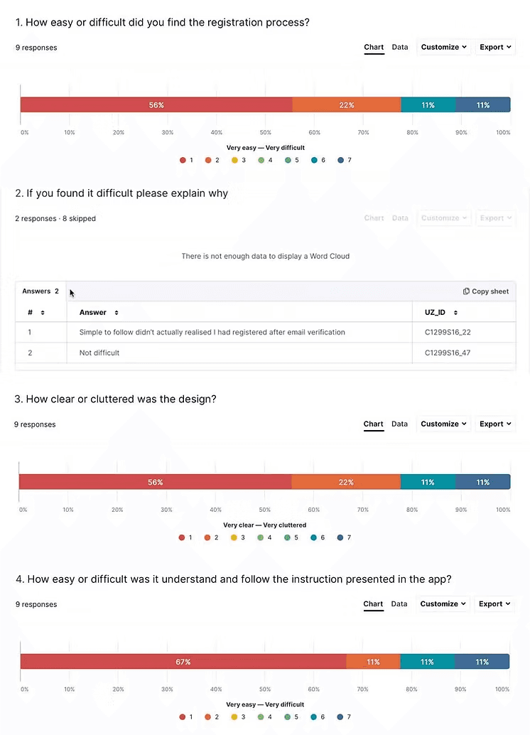
Research revealed multiple points of failure throughout the journey.
Customers were being incorrectly routed between login and registration flows, becoming trapped in partial registration states, abandoning email validation and struggling to recover when things went wrong.
To understand both the customer and operational impact, I combined:
Analytics data
Customer feedback
App Store reviews
Journey mapping
Call-centre insights

Simplifying registration and login
Journey mapping revealed unnecessary friction, confusing transitions and recovery paths that failed to support customers when things went wrong.
The redesigned flow focused on helping customers complete registration successfully on their first attempt by:
Recognising partially registered users
Simplifying registration and login journeys
Improving biometric setup
Improving guidance and error handling
Reducing unnecessary friction

Removing a major point of drop-off
Email verification was one of the largest causes of abandonment. Customers were required to leave the app, locate a verification email and navigate back to the correct point in the journey.
New functionality allowed customers to open their email application directly from the app and return seamlessly once verification was complete. This reduced abandonment and helped more customers complete registration successfully.

Supporting customers through self-service
Analysis showed that many support requests stemmed from a relatively small number of recurring onboarding issues.
A dedicated help centre was introduced to answer common questions and direct customers towards self-service solutions before escalating to chat or call centre support.
This reduced pressure on support teams while improving the customer experience.

Improving clarity and usability
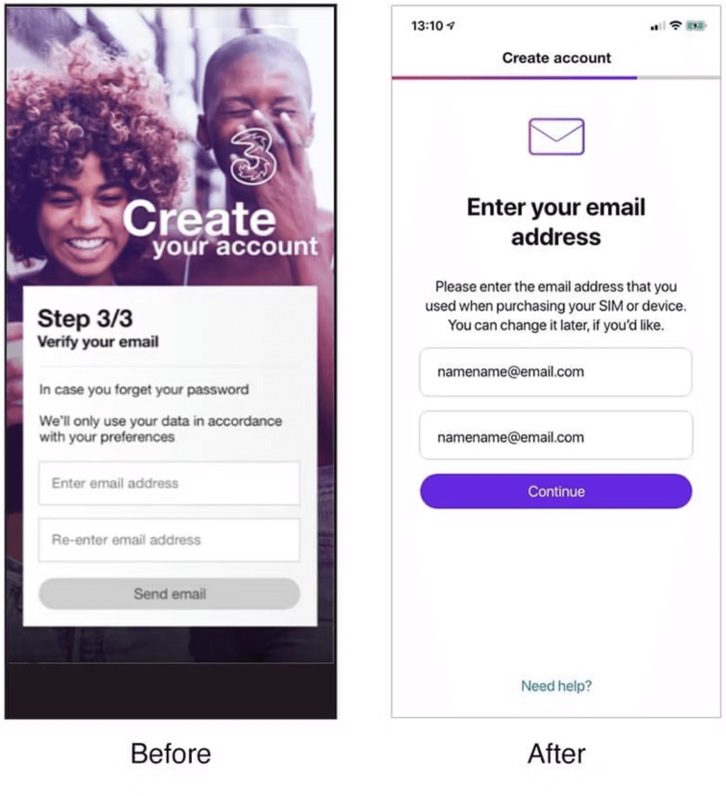
The interface was redesigned to improve comprehension, reduce confusion and support successful completion across a wider range of devices and user contexts.
Landing screen
Clearer onboarding entry point
Earlier access to self-service support
Stronger call to action
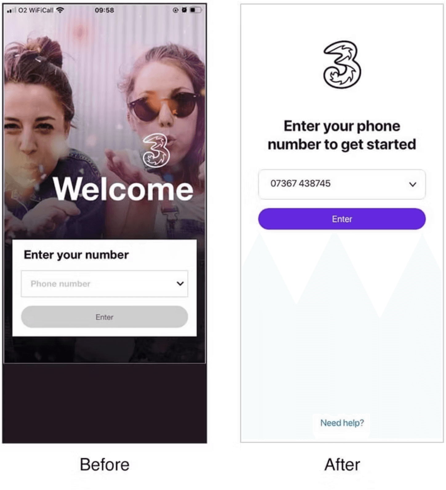
Welcome screen
Progress tracking introduced
Simpler, friendlier content
Improved accessibility

Password screen
Reduced user error
Improved password visibility
Clearer guidance

Email screen
Clearer verification instructions
Reduced confusion
Better information hierarchy
Verification screen
Open Email functionality introduced
Fewer abandoned registrations
Clearer completion journey
