
Three App: Design Library
Building a design system
When I began this project, no design library was in place. This meant that designs were inconsistent and time consuming to produce.
I created a library of reusable resources to speed up work flow and allow for future iterations to be rolled out globally.
The design library, created in Adobe XD took into consideration:
-
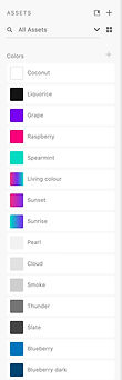
Global components linking colours, type styles and icons for easy editing across all design files
-
Alternative states such as error states and tap states etc.
-
Reusable app modules including navigation and tab bars, popups and snack bars
-
Accessible counterparts using dynamic type sizes

Accessibility
For every module that I created in the design library, I made sure there was an accessible version available.
This meant that we could quickly mockup designs with large type sizes for users who chose to have larger fonts turned on at device level.
By default, every module was also checked to ensure AA accessible colour contrast.


Alternate states
To speed up workflow, I used Adobe XD to create multiple states for each module.
For example, you could quickly include a button as a symbol, and then with one click change it from a primary to a secondary button.

Component parts
As part of the new designs I created components that can be reused at speed when creating new designs.
Using component parts ensures that every instance of a module is consistent, and also all modules can be updated globally if a change needs making. So all designs are then future proofed.
