The wuntu app
Overview
This project was a contract role working on the loyalty and rewards app Wuntu, run by Three, the telecoms and internet service provider.
Over the course of the project we introduced multiple discounts in high street shops, restaurants and beauty salons into the app.
The challenge was to categorise these new offers and add a search and filter functionality, and to turn multiple redemption journeys into a seamless user experience. We also worked on personalisation piece to offer relevant content to users.
The overall aim was to increase app engagement and customer retention.
Project Duration
16 months
Background
When the app first launched, the proposition was to provide both discounts and freebies like free Costa coffee and Greggs sausage rolls. Three was subsidising these rewards under a reciprocation influence but it soon because too costly and therefore unsustainable.
Three made the decision to remove these freebies and replace them with exclusive discounts for Three customers. However, this approach was unsuccessful and Three saw a 50% drop in app engagement. So the research began!

Surveys and Feedback reviews
Qualitative data was collected from in-app surveys, social media feedback and iOS App store and Google Play App reviews.
From a proposition point of view, it became apparent that users were unhappy about the removal of regular freebies, because let's face it, who doesn't want free stuff?
Customers were also saying that the current discounts were not relevant to them. Many commented that offers were only London based, or for thing they weren't interested in.
Much of the information that came out of this type of testing was about the business proposition rather than the experience of using the app. I wanted to speak to customers in more detail.


User interviews
I arranged to spend some time visiting Three's high street stores, talking to customers about their experiences with the app.
I wanted to understand:
-
Which types of offers users liked and didn't like
-
How users navigated the app to find the offers they wanted
-
How users would approach a challenge to find a specific offer
Findings
-
Users struggled to find offers because they were not categorised well
-
Lack of search functionality meant users had to scroll through everything to find relevant offers

Card sort and questionnaire
Users told us that there were not enough local offers. In response to this, Three partnered up with new companies to enable them to offer thousands of discounts in shops, restaurants, beauty salons and more.
We knew from testing that even with limited offers, users struggled to find offers relevant to them, so using the new offers, we performed a card sort to figure out how to integrate all these new offers.
Open card sort
Allow participants freedom to organise topics into group as label them as they choose.
Find patterns of groups of content and understand the language used for group names.


Hybrid card sort
Participants grouped topics into predefined groups and ask further questions based upon previous sort.
See if expected groups match participants choices. Dig a little deeper to understand user needs


Suggestions
-
Personalise layout based on previously claimed offers
-
Include 'nearby' category based on users location
-
Add map functionality
-
Add search and filter functionality
-
Categorise offers in multiple categories
-
Surface web chat during potential point points (claim code, offer details)
-
Notify users when new relevant content content becomes available
-
Allow users to change location
-
Organise content into suggested categories (as found in the next section)
Information Architecture
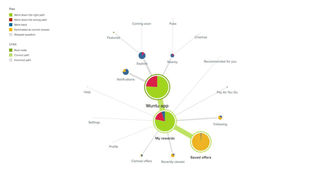
Following the card sort, I created a site map the following site map using Overflow and presented to developers and stakeholders.
Goals
-
Present a hierarchy for categorising new offers
-
Add bookmarks to assist with memory recall
-
Integrating new offers with current functionality
-
Present multiple redemption journeys into seamless user experience.

Tree testing
To test the proposed site map we ran a Tree Test in Optimal Workshop. We gave participants 8 tasks to complete and measured the success rate.
Method:
Create a sitemap based on the previous rounds of cards sorts and set tasks for users to find correct answer.
Goal:
To see if proposed sitemap correlates with where participants actually want to go.
Outcome
Based on 8 tasks, we saw an average success rate of 90%. On that basis, we went ahead with the proposed site map with some small tweaks.
Personalisation
During the tree test we discovered that users wanted a place where they could quickly see offers relevant to them.
Everyone is different, and we had data on which offers a particular user had claimed in the past, so we wanted to create layout that used this data to to dynamically change content depending on each users needs.

Wireframing
To establish the hierarchy of content I produced wireframes to handle a number of factors.
Personalisation
Variations were also created based on personalisation to serve relevant content to users based on their interests.
Scannable content
Users need to be able to easily scan content for different types of offers with different information.
Integration
New partners and offers had to be added into the app without jeopardising current functionality.
Redemption journeys
The layout had to suit multiple partners all providing different redemption journeys.

Applying the brand
Illustrations
Using an established, limited colour palette, we found a way to develop and illustration style to use throughout the app that promotes a fun and friendly brand.
Typography
Three's brand typeface is Helvetica Neue. However, because we were building a native app we instead used default iOS and Android fonts to support dynamic type styles.
Final screen flows and designs
Here is a selection of Hi-Res flows, bringing together the IA, the wireframes and the brand look and feel. This is by no means complete but should give a good feel for the app.


